I’ve written about panoramas before, once about making them in Photoshop and once about printing them on my Epson 2000 printer. However, I’ve never bothered to compare the results of all 6 of the options Photoshop offers for making them. This is primarily because whenever I’ve read about Photoshop panoramas, the advice given was to just use the “Auto” option. (I’ll have to admit that my lack of trying all the other options is also partially due to impatience or laziness on my part.)
Yesterday I was photographing some concerts that were part of the University of Wisconsin Summer Music Clinics. I wanted to try to capture the feeling of the audience of proud parents, grandparents and other relatives watching the young, talented musicians perform. It seemed like a panorama would be the best way to do this. The results below are all from the same 4 images captured in one of the concerts. The original images were taken hand-held with a Canon 7D and a Canon 17-85 mm IS EF-S zoom. The room was rather dim so I used a manual exposure of 1/30 sec at f/5.6 with an ISO of 800. I didn’t want to use a higher ISO because I’ve found that the noise really starts to go up significantly at higher ISOs. Although the musicians were moving, most of the photo captures the audience, which was not moving much.
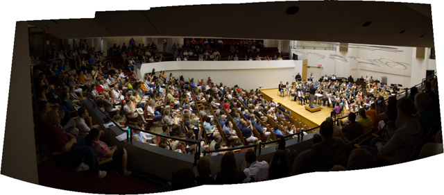
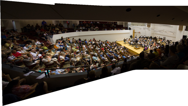
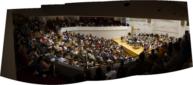
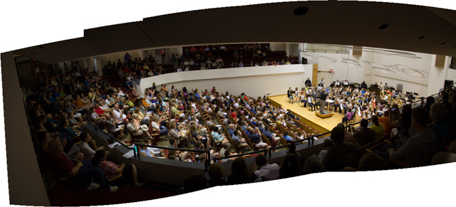
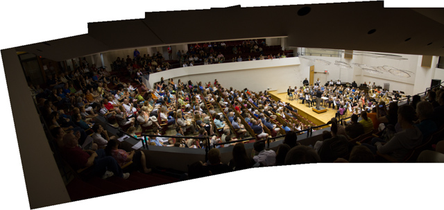
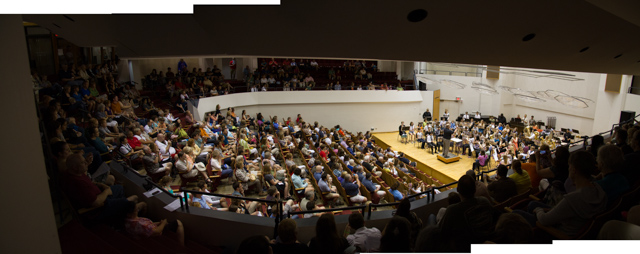
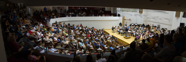
The results of all 6 Photoshop options are shown below. I did not crop or make any other changes to them other than to flatten the files and convert to jpg. Although they are all reduced to the same 640 pixel width for display here, the actual results varied in size. The option used and the actual resulting image size is listed below each of the images.
Option 2 is by far the worst; the distortion is terrible. Option 5 didn’t handle the merge very well; note how over the stage the ceiling suddenly drops down. Option 4 has too much curvature for my taste. Options 1 and 3 are almost identical. Option 6 is very similar to 1 and 3 with possibly a little more distortion on the left edge.
So, what did I use? I didn’t even consider 2, 4 or 5, of course, and after playing around a little with cropping and minor rotating, I finally ended up using 6, the final version of which is shown below.
Despite all of this effort, I suspect that the “best” result, though it could vary with the starting photos and the taste of the photographer, might be “Auto” more often than not. Even though I didn’t use it here, I doubt that using Option 1 would have made much difference.
